
You must log in or # to comment.
They all have their merits
Yeah and the guitar intro
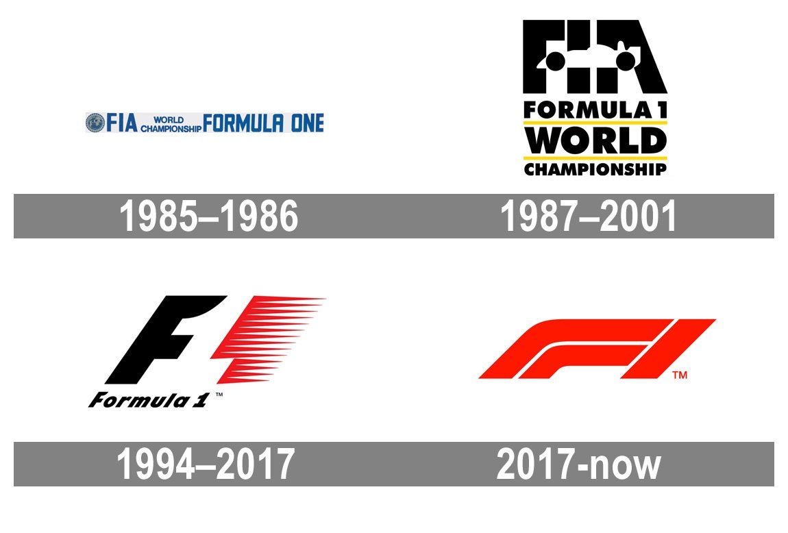
Here is my list why the old logo was wrong from a designer point of view in 2026. Keep in mind that this is very much depending on fashion, the logo may have been working very well during its time:
- The angle of the italic “Formula 1” is way too steep, this font is not suitable for that. I also have doubts regarding the tracking/kerning of the bottom line (space between the letters of “Formula”).
- The bottom F is place exactly in line with the big size F above it. You can verify that with a straight edge of a piece of paper. But visually it is a bit to the left. This could have been adjusted. Same for the 1 in the bottom line alignment with the end of the top 1.
- The logo does not work when reduced to small size, there’s a blurry red mess at the right side.
- A good logo is immediately recognizable/readable, but the old logo is an ambiguous image.
- The logo works completely different on black background and its ambiguity makes it again less recognizable
By the way, I believe the TM trademark in this image is a later addition and was not part of the original design. And that shows.
I also miss the less toxic fans.